| introduction |
| profiling the marginalised |
| key policy goals |
| profiling the marginalised | |||
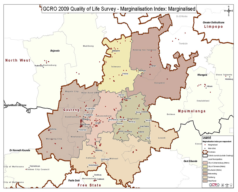
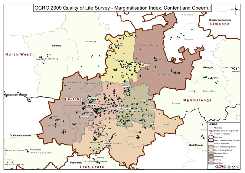
‘The marginalised’ are unevenly distributed around the GCR, peaking in Westonaria (16.4%), Randfontein (13.8%) and Nokeng (9.1%): in the three metropolitan areas, they drop slightly below the overall score (at 4.3 - 4.4%). In this sense they are quite literally marginalised, viewed spatially. At the other end of the scale, the ‘content and cheerful’ are considerably above the average score in Tshwane (27.1%), Johannesburg (25.5%), and Kungwini and Midvaal (both 25.0%). They are notably below average in Ekurhuleni (at 17.6%), suggesting that merely residing in one of the cities in this region of cities is an insufficient condition on its own to score high on the index. Women were more likely than men to be marginalised, a situation that reversed among the ‘content and cheerful’. Generally, men predominated in the top two categories, women in the bottom two. And of course race matters too: Africans are above average in the marginalised category, coloureds well below average, whites barely register and Indian respondents did not feature at all. Indians only featured in the top two categories. At the top end of the scale, Indians (37.25%) scored high, as did whites (35.5%), followed quite closely by coloureds (31.5%) but dropping to 19.9% among Africans. The ‘at risk’ category comprised Africans (9.6%), coloureds (6.8%) and whites (1.3%). |
|||
| distribution of ‘marginalised’ and ‘content and cheerful’ respondents across the GCR | |||
 |
|||
 |
|||
| GCRO (2009) ‘Quality of Life’ survey | |||
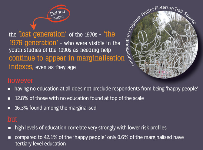
| Analysing the scores against age suggests that the most marginalised age cohort (though more fine-grained analysis is needed here) comprises those aged between 46 and 65 – people who were born under high apartheid, are still of working age, and have either been by-passed by the ‘democracy dividend’ or have failed to adjust to life in a democratic South Africa. Looking at the ‘marginalised’ group, 4.5% of 18-35 year olds featured – looking like the sample average – dropping to 3.6% among those aged 36-45, but rising to 5.9% of those in the 46-65 cohort and staying high (at 5.1%) among the older cohort. The ‘lost generation’ of the 1970s – ‘the 1976 generation’ - who were visible in the youth studies of the early 1990s as needing help, continue to appear in marginalisation indexes, even as they age. | |||
 |
|||
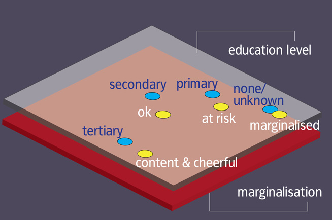
One of the things sacrificed by the 1970s youth was their education, and education correlates very powerfully with the index (we return to this below). It is worth noting that having no education at all does not preclude respondents from being ‘content and cheerful’ at all – looking within those with no education we find 12.8% at the top of the scale and 16.3% among the marginalised – but having high levels of education does correlate very strongly with lower risk profiles: 0.6% of the marginalised had tertiary level education, compared with 42.1% of the ‘content and cheerful’. Marginalisation features more strongly among the unemployed (7.0%) than those in employment (2.5%), and the reverse is true at the top of the scale. But in the middle of the scale, looking at those out of work, 69.2% are in the ‘OK’ category and 12.2% ‘at risk’. And of course money matters: among respondents who told us their households have no regular source of income, 17.5% were marginalised, 15.4% ‘at risk’, 61.5% were ‘OK’ and just 5.6% were ‘content and cheerful’. As incomes increase, this reverses almost entirely – by the time monthly household incomes reach between R6 401.00 – R12 800.00, marginalisation has dropped below single figures and is scoring in decimal points. These data need more detailed interrogation, analysis and mapping, but the very basic pattern given here suggests that indexing and multivariate analysis will provide more nuanced analysis than standard two-variable cross-tabulation that comprises so much survey reportage; and that such analysis is necessary if we are to provide new analytic perspectives rather than merely repeating that an admixture of race and sex (and, occasionally, class) affect life chances and world view. Elsewhere, we use correspondence maps to analyse the relationships between quality of life and key variables; here we focus on marginalisation. Focusing on education, we find a remarkably strong correlation between higher education and lower marginalisation. It should be noted that this correspondence map is quite remarkable for the proximity of points and ease of analysis: it lays out very clearly the extent to which the marginalised core generally lack education; the point for those ‘at risk’ lies very close to those who completed only some primary education; the points for ‘OK’ and secondary education are actually on top of each other, the correlation is so close; and the ‘SHP’ (our ‘content and cheerful’) correlate very closely with tertiary education. Education is clearly a critical deliverable: this is reflected in its apex position among the priorities of the Gauteng Provincial Government. |
|||
 |
|||